Harley Davidson Curated Ride Experience IOS App for motorcyclists
Problem and Business Goals
Harley Davidson engaged our team at Pivotal to validate and develop a curated ride experience for motorcyclists. Motorcyclists were purchasing Harley Davidson bikes, but weren't going on as many rides. Business goal was to get "more butts on bikes". One of their KPIs was that if they got each rider to go on 3-4 more rides a year, it would increase servicing and bike part purchasing. They also had a ride planning app on desktop that was slow and not very useful for short term rides. They wanted to tap into native mobile app space, similar to Rever and Strava but for Harley Brand loyalists.
Team Breakdown and Timeline
Pivotal: 2 Designers, 1 Product Manager, 6 Developers, 1 Product Owner, 1 Client PM, 1 Client Designer, 2 Client Developers.
3 weeks Discovery and Problem Framing Phase, and 8 weeks of development for MVP.
Project Kickoff
We facilitated a workshop to develop a shared understanding of goals (business, product and engagement), customers / users and risks so we can get started on exploring various design opportunities. We developed a proto-persona, Gunther, so that we can quickly start testing and validating our assumptions and have a better understanding of our persona.
Product Discovery
Due to business constraints, we had a very short discovery and framing phase to quickly validate the business and product goals so that our client could share out the direction our app was going to get approval from their shareholders.
Generative Interviews: We needed to validate or invalidate our assumptions from the workshop, so we screened for Harley Owners, like our Persona, Gunther. We conducted several rounds of generative interviews to gain a deep understanding of their context by identifying their needs, goals, and pain points. This was done through 1 hour long remote and in person interviews. We synthesized these learnings through affinity mapping.
Greenfield Product Discovery
Due to business constraints, we had a very short discovery and framing phase to quickly validate the business and product goals so that our client could share out the direction our app was going to get approval from their shareholders. This phase was 3 weeks to validate a totally greenfield idea.
Generative Interviews: We needed to validate or invalidate our assumptions from the workshop, so we screened for Harley Owners, like our Persona, Gunther. We conducted several rounds of generative interviews to gain a deep understanding of their context by identifying their needs, goals, and pain points. This was done through 1 hour long remote and in person interviews. We synthesized these learnings through affinity mapping.
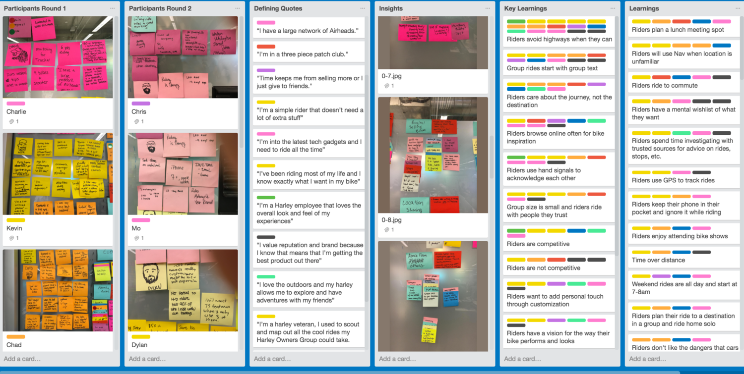
Process Tidbit: Once I've started the affinity mapping process of collecting user behaviors, goals, and workflows, I create a Trello Board to capture my learnings and key insights. These are color coded to match the sticky colors of the participants. If I have learnings with more than 1 pattern, they are in learnings, if there are more than half, I include them in the Key Learnings. This way, I can prioritize the learnings to frame the problems.
Key Insights from Generative Interviews
Reasons to Ride: Riding is a solo, personal experience
Reasons not to ride: Family time and other commitments keep riders from riding more, and bad weather keep riders from riding
Planning Interactions: Group rides start with texting during the week
Safety: Riders are wary of dangerous road conditions and competition in group rides is dangerous.
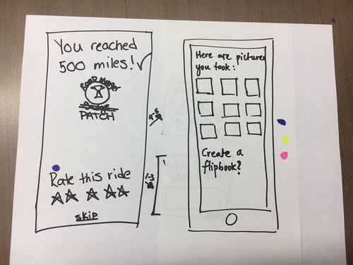
Gamification: Riders are competitive and want acknowledgment for their achievements.
Stops along the way: Riders always plan a lunch meeting spot for group weekend rides
Navigation: Riders will use navigation only when the location is unfamiliar to them, and will pull over to check maps if they need to, they don’t use the screen while riding.
Other Apps: Riders use Google Maps, some riders use tracking apps for other activities (strava, fitbit).
Sketching
At Pivotal, we spend a lot of time sketching. We usually frame our sketching with scenarios to help us have a jumping off point. Scenarios are not prescriptive as to help us defer judgement and come up with creative solutions. We converged on our sketches by dot voting various concepts and features we thought would be valuable in solving the user's problem.
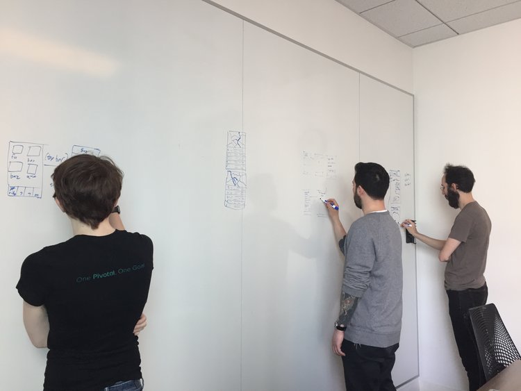
Design Studio Facilitation
Because our team was very large, it was getting increasingly difficult to get everyone to share and contribute ideas, especially if team members were quieter than others. So I facilitated a workshop where we could share and contribute ideas using the improv technique "Yes! And..." and a graffiti wall. I had each team member take a large portion of a whiteboard wall and sketch out an idea. Then have 1 minute to present each idea. We would rotate to a different board and add on top of the existing idea. By the end of the exercise, we had several ideas that everyone had contributed to, and they were great! We brought in our Product Owner, and had her vote on some of the sketches so that we can start testing.
Round 1 Low Fidelity Iteration & User Testing
Tools: Sketch, Photoshop, inVision
Learning Goals: We’ve heard from our users they plan rides usually through texts. Will users want to click to go to an app?
Scenario: Gunther receives a text from his friend Charlie about a ride with a link. Gunther clicks on link and opens the app.
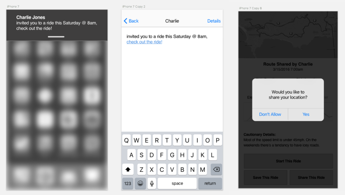
Round 1 Findings: Users had no qualms receiving a link from another rider, and they were fine with sharing location because location and riding go hand in hand!
Round 2 Low Fidelity Iteration & User Testing:
Tools: Sketch, Photoshop, inVision
Learning Goals: What information is valuable to Gunther when he's going on a group ride? What information does he need to start this ride? What should he expect by selecting "Start this ride?". What does an in-app navigation experience look like?
Scenario: Gunther views the route details. Gunther starts the ride.
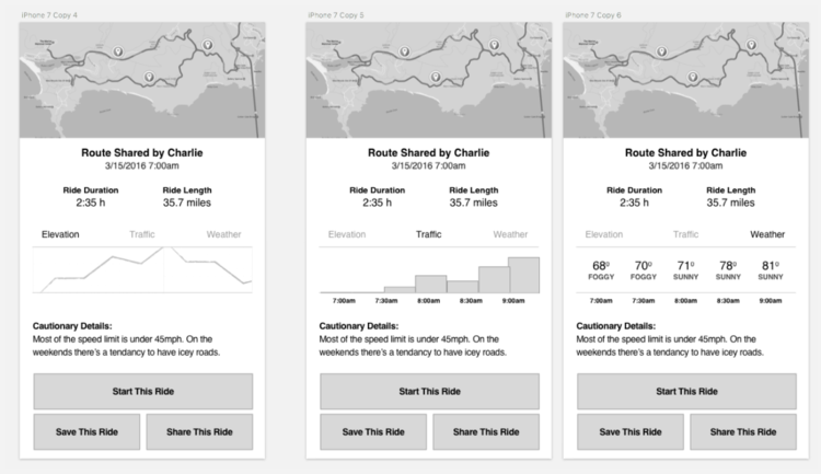
Round 2 Findings: Users found the map, weather and safety extremely helpful. They didn't find Elevation particularly useful. They liked the waypoints on the map, but wanted more details on those specific waypoints. When they started the ride, they found the gas stations and the cautionary details very helpful. They didn't find the group messaging particularly helpful. They also wanted crowdsourced photos and routes.
Round 3 Low Fidelity Iteration & User Testing:
Tools: Sketch, Photoshop, inVision
Learning Goals: Taking feedback from the previous rounds, we dug into planning and adding routes. How did riders feel about crowdsourced rides? If so, how would they expect to plan those rides? We wanted to capture their behaviors and attitudes around sharing.
Scenario: Gunther wants to go on a ride, he opens the app...
Round 3 Findings: Riders really enjoyed this experience, they could see suggested rides based on their location and also see how other riders felt about the ride based on the rating. They also were interested in creating rides, but wanted a more visual way of adding waypoints.
After a few rounds of user testing with low fidelity clickable prototypes we learned the following:
Riders expect to see weather and safety details such as road conditions and traffic.
Riders found the curated experience inspiring
Riders want to see a map with their location and all the routes close by
Riders want crowdsourced photos of waypoints
Riders want suggestions by other riders for POIs, and recommendations
Riders want suggestions by other riders for POIs, and recommendations
Production & Delivery: After our short Discovery & Framing period, we held a kickoff with our stakeholders and prioritized our features using a 2x2 of user value and feasibility. While the stakeholders wanted ride tracking, a profile page, and bike part selling features, they saw from our research that it wasn't as valuable for helping riders feel motivated to go out and ride their bikes. So they moved them down the list!
Selected High Fidelity Iteration & User Testing:
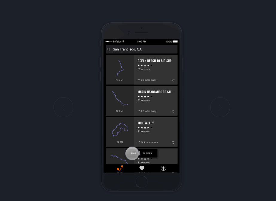
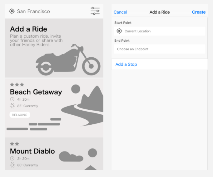
Selecting a Ride List View: What decisions factor into selecting a ride? What types of information help riders in making that decision? What does a list view need for riders to make a decision?
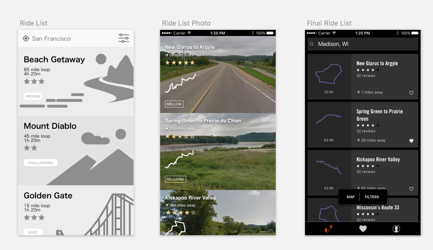
We explored a list view for riders to help them select a ride. From early on, location was very important, as well as ratings and distance to the start of the ride. We went through many rounds of testing, and learned that, while photos of the rides are nice, ultimately the route shapes help riders determine route selection. "How many twisties are there on this ride?" Ratings were also a feature that alerted riders to the overall experience of the ride. And route "mood" was something they found intriguing, but not helpful.
Route Details: What information is valuable for a rider? Is this information helpful for selecting a ride, during a ride or both? What information should be displayed first?
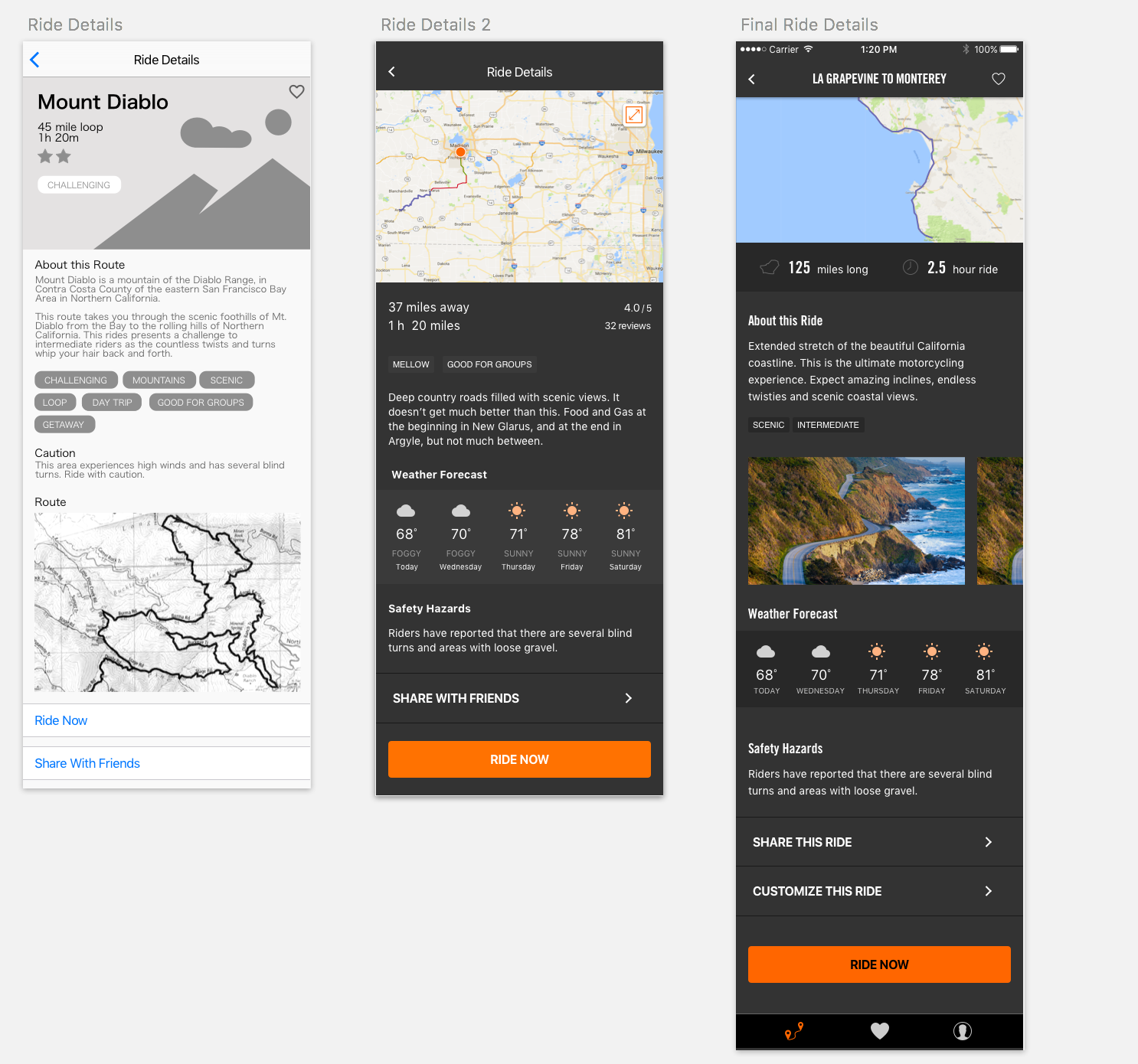
Through countless user interviews, we learned a lot about the kinds of information were helpful for the riders. This helped us to put more urgent information in the top, and secondary information towards the bottom. Duration, the interactive map, and route length were very important and featured on the top. Weather, safety, and details about the ride were next. Riders wanted to click into the map of the ride and pinch and zoom in, so we made that more interactive. We put our Ride Now CTA and other buttons in the end. We later changed the ride now button to be persistent.
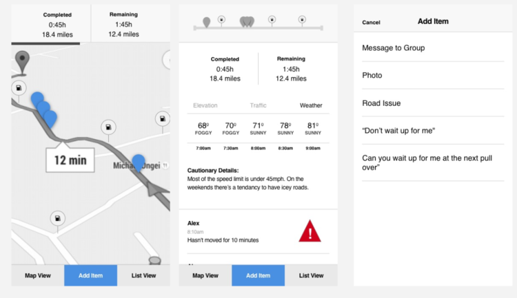
Map Expanded View/POIs: Riders want to see Points on Interest along the way, what information is helpful for them?
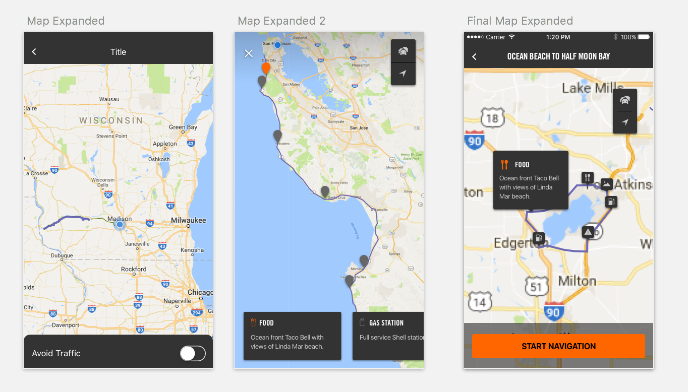
When we first created the pinch and zoom map of the route, we realized there was an opportunity to add waypoints. Riders often stop throughout the rides for scenic views, rest, gas and food. They also want to zoom in and look around for side roads, especially if there is traffic. We included a FAB traffic button, and tappable POIs. We also learned that they might want to start navigation from this view as well, especially if they stopped during the ride. So we added a persistent start nav button.
Navigation Experience: Navigation for motorcyclists is very different than for drivers of cars. How does this experience differ?
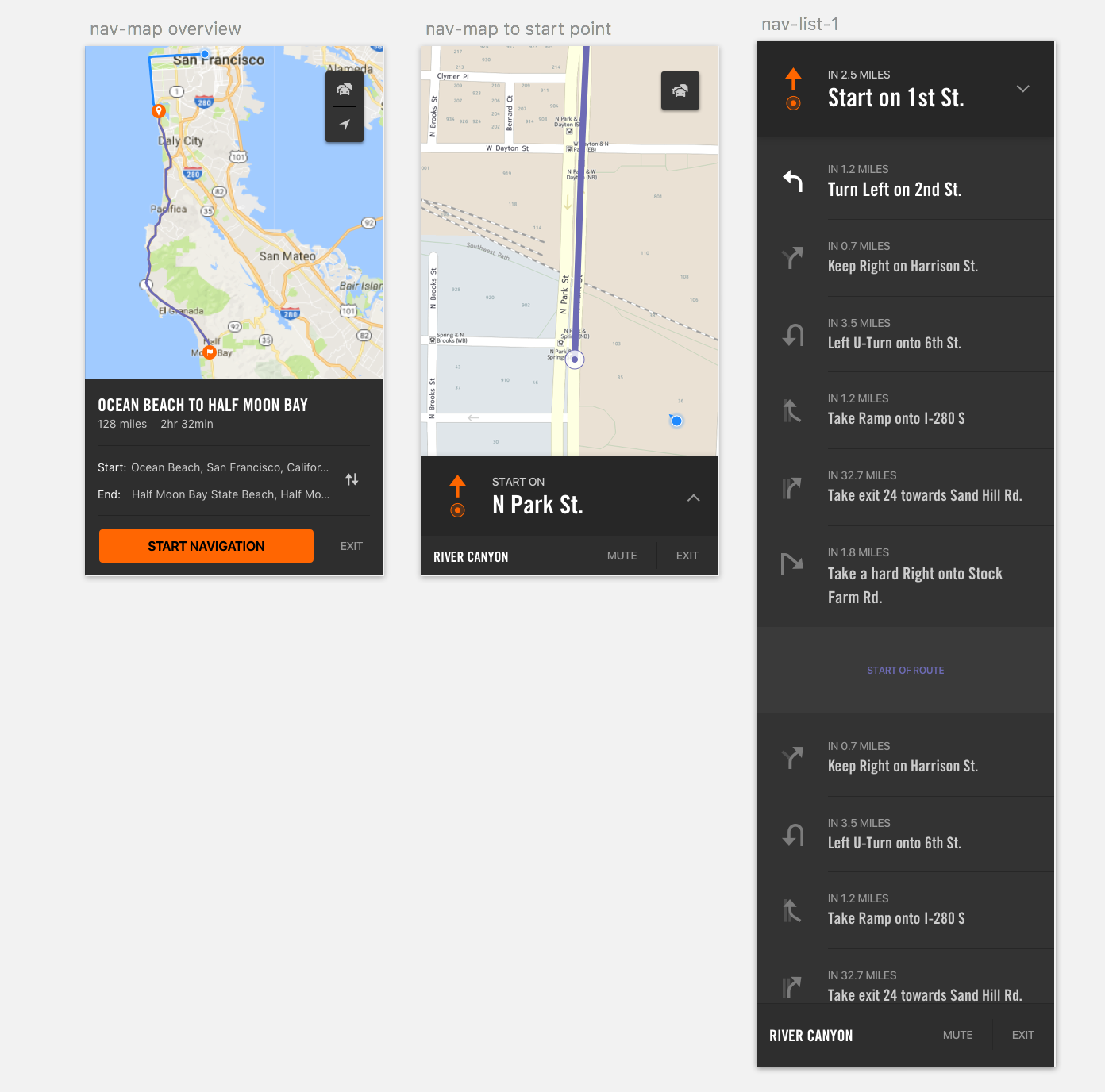
This was by far the most challenging to design and the most fun to test! We learned that riders wanted to see where the route started (Purple) and where they were in relation to the route (blue). They wanted to know the distance, the opportunity to reverse the start and end points. From their, we did many rounds of usability testing, we rented a car and had someone drive, while we tested the navigation experience! We also had Harley Davidson employees come to our office, and go on some of our rides and give us detailed feedback. This was challenging as safety is our number 1 priority. We prepped them with what kinds of information we needed, and where the app failed to help them. We learned a lot about riders and how they interact with the app. For example, if they are wearing gloves (most riders do) the touch radius needs to be much bigger than the standard 46px radius.
Map vs. List View: While the list view was helpful in selecting a ride, they wanted to see where the rides started and looked like in relation to where they were. The map view earned it's way in and became the main view when the rider opens the app.
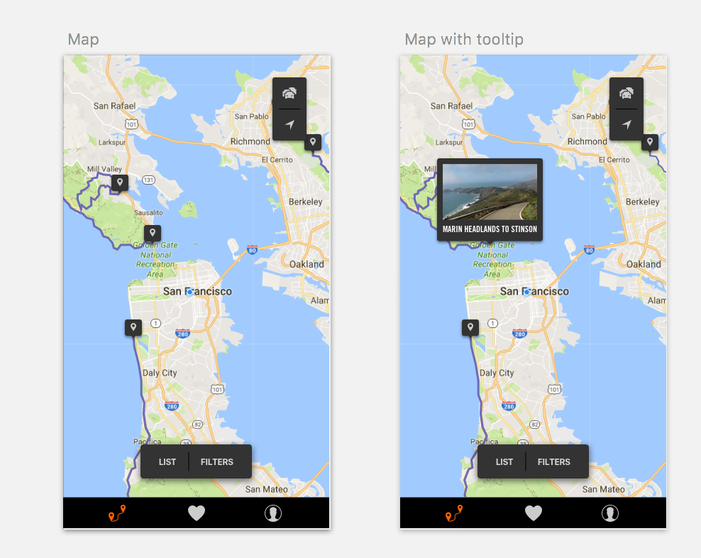
We made this experience very similar to the map expanded view with the POIs. Having similar validated interactions reduces cognitive load on the users.